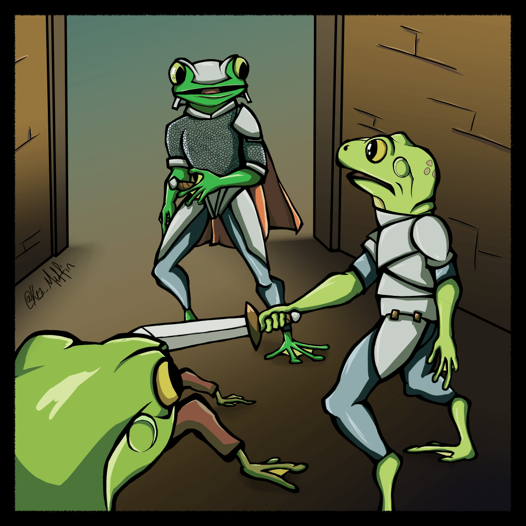
I’ve hit a bit of a speed bump with my comic lately, I’m not entirely sure that this is actually the style I want to keep or not. I don’t have many completed pages yet so changing it now isn’t going to be too much of a problem but I’ve just been taking a bit of break to see how I feel about the style when I come back to it (even looking back at it again now, I am quite liking it and I think it will be what I end up going with).
Anyway this is from one of the earliest pages in the book and the only one I’ve really got to a completed state (minus text).
Here is another style test for my comic I will hopefully now get around to completing. This time, Frog Guy is sitting next to a fire. Ignore the background colour, that won’t be the final background on these tests.
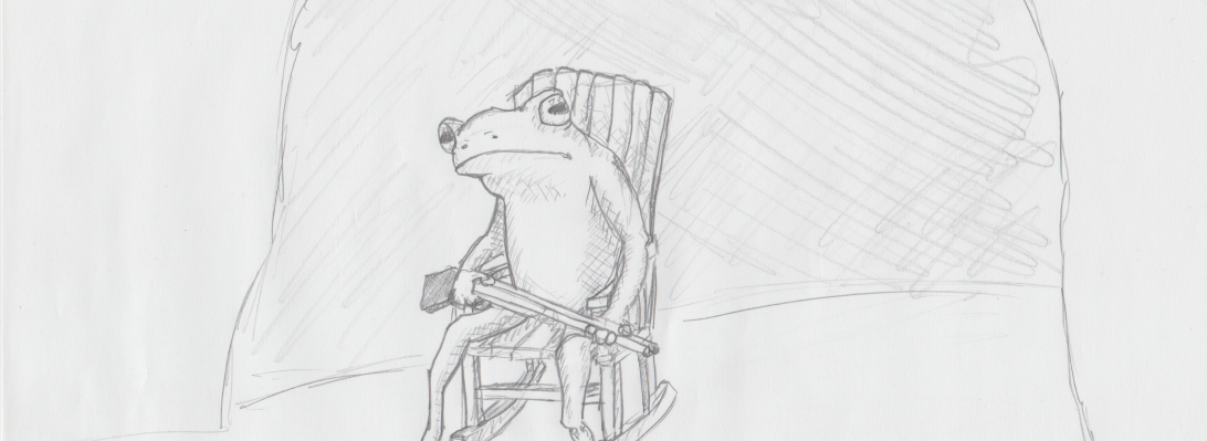
So I’ve had this idea for a graphic novel (about frogs unsurprisingly…) that I started working on about 5 years ago but then fell into a bit of a rut. When I started this blog it was meant to help me restart the thing. I got about 2 pages sketched back when I started the blog then kind of forgot about it….
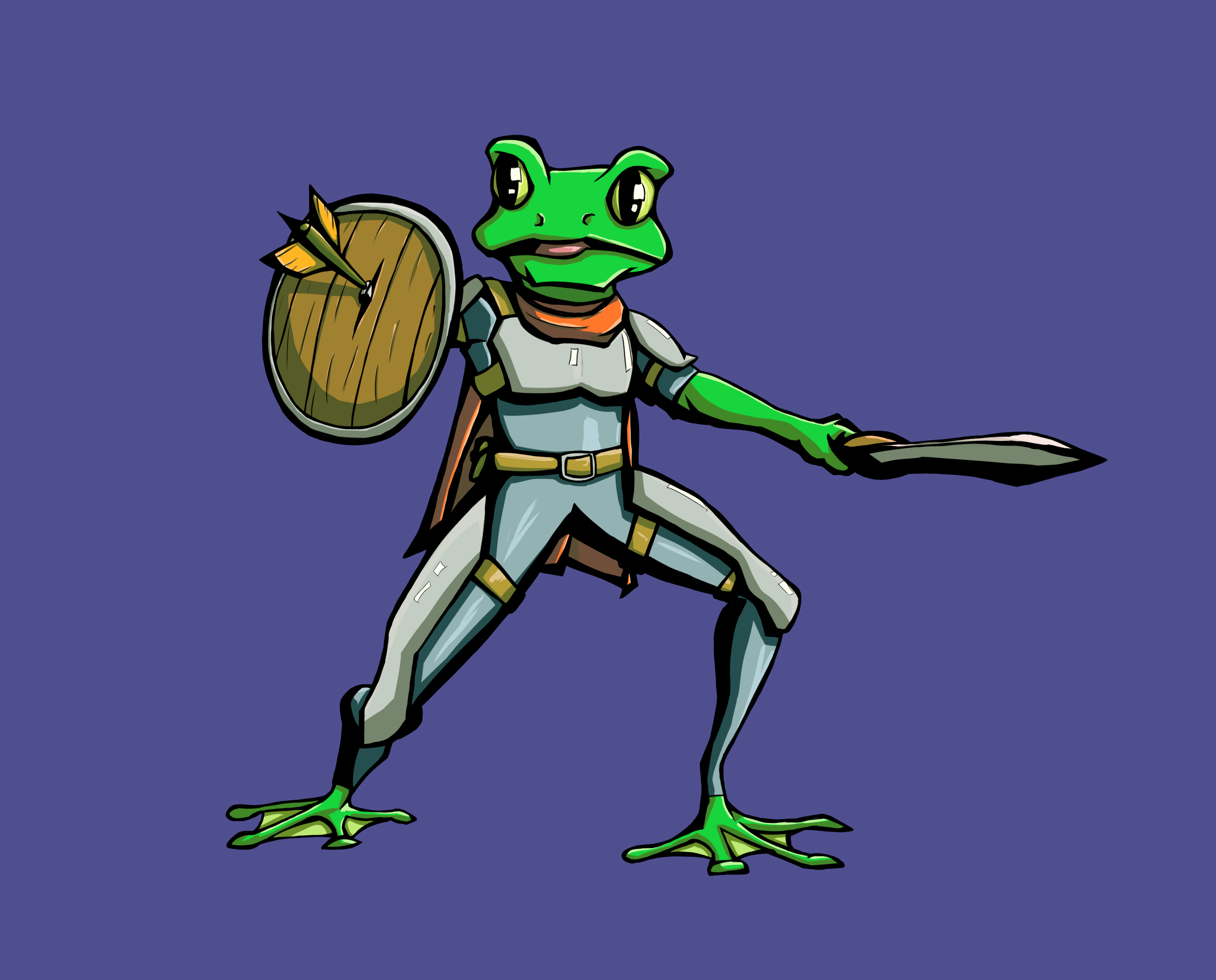
Anyway, I was looking over my sketches the other day and I really liked this one that I did for the cover image and decided I should have a go at inking and colouring it to kind of get back into it but also get an idea of how I want it to end up looking. This isn’t really how I had pictured it in my head but I kind of like how it turned out. It is a lot more saturated than I planned and also a bit cleaner. The big inspiration I had way back when I started this was Mouse Guard by David Petersen so in my mind it was kind of more that style.
But it turns out I actually really like what I did with it, I’m not sure it really fits in with the story and setting but I am reworking a lot of that anyway so I think it could work (which is really handy because I will be able to recreate this style pretty easy when I finally get around to doing the whole comic 😛 )